
Crunching numbers. Please wait...
How to Use the "My Watchlist" Dashboard
Your personalized My Watchlist dashboard is designed to help you quickly understand options positioning, volatility conditions, and potential price dynamics for the tickers you follow.
The goal of this page is simple: provide a structured snapshot of the market so you can quickly identify opportunities and avoid poor setups.
Getting Started
To begin using your dashboard, enter up to 40 tickers that you want to track.
Once added, Trading Volatility will calculate key market structure metrics each day. You can also enable the daily email summary from the Alerts page to receive updates on GEX changes and rating shifts.
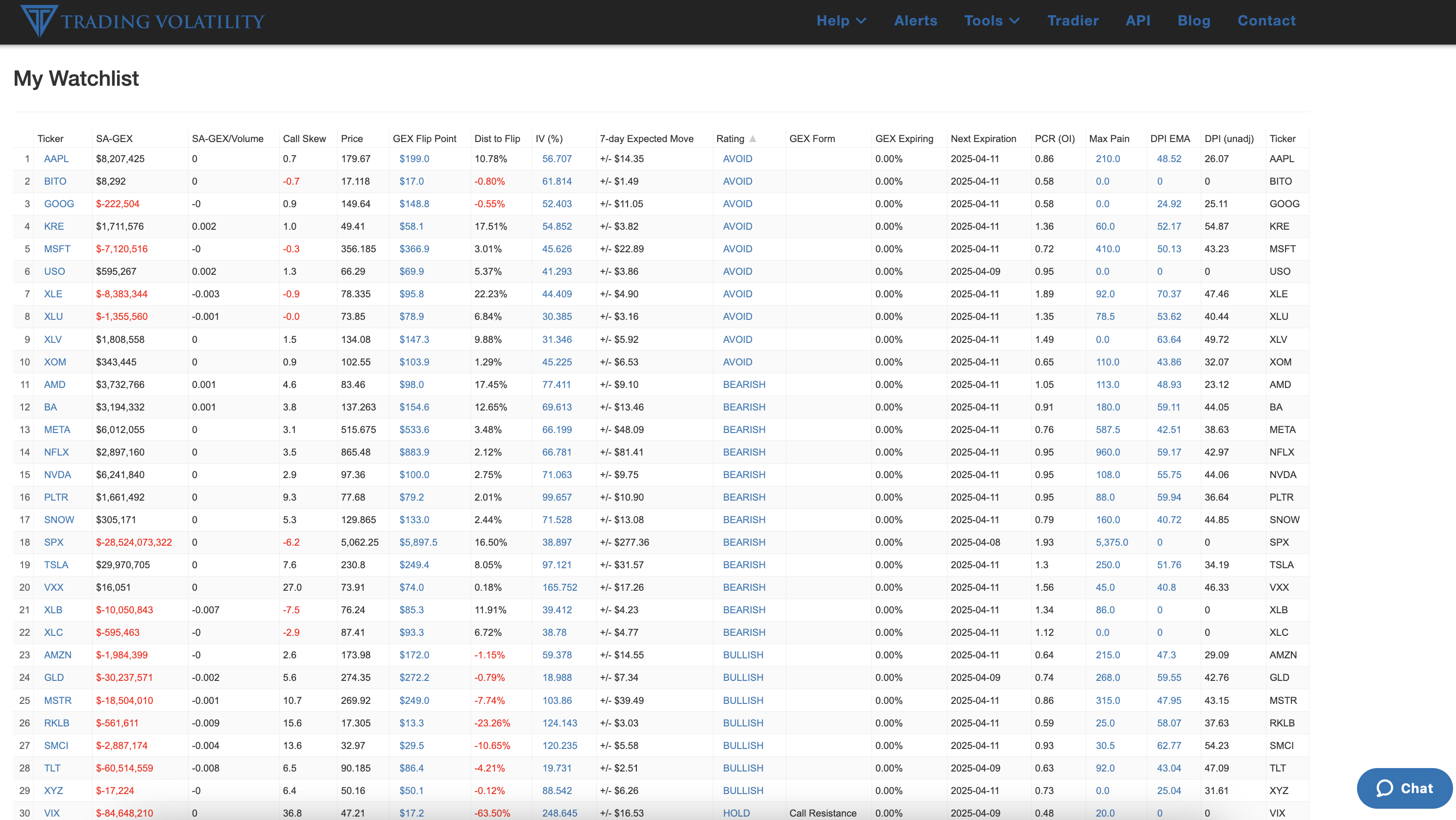
1. Use the Rating as Your Compass
The Rating column summarizes the overall options positioning and volatility context.
- BULLISH – Market structure supports upward price movement.
- HOLD – Bullish trend but risk of consolidation.
- WAIT – Transitional setup; often near bottoms.
- BEARISH – Downside pressure or unfavorable positioning.
- AVOID – Weak structure with limited directional edge.
Takeaway: Start by scanning the Rating column to identify the most interesting setups.
2. Understanding Gamma Exposure (GEX)
Gamma Exposure (GEX) estimates how options dealers are positioned relative to the underlying stock.
- Positive GEX often stabilizes price movements.
- Negative GEX can amplify volatility.
The magnitude of GEX can also indicate where dealers may need to hedge aggressively, which can influence short-term price movements.
GEX/Volume helps normalize GEX relative to recent trading activity so you can compare positioning strength across tickers.
3. The GEX Flip Point
The GEX Flip Point represents the price level where dealer positioning transitions between positive and negative gamma.
- If price is above the flip, markets are usually more stable.
- If price is below the flip, volatility often increases.
The Dist to Flip column shows how close the current price is to that level.
Takeaway: When a stock is very close to the flip point, even small price moves can change market dynamics.
4. Skew and Sentiment (25-Delta Risk Reversal)
The 25-Delta Risk Reversal measures the relative pricing of calls versus puts.
- High values → Calls are more expensive than puts (bullish sentiment).
- Low values → Puts are more expensive (defensive positioning).
The dashboard shows both the current skew and the 30-day trend so you can see how sentiment has been changing.
5. Implied Volatility and Expected Move
IV (%) represents the market’s expectation of future volatility.
The 7-Day Expected Move converts implied volatility into a dollar range the stock is statistically expected to move within over the next week.
This can help traders:
- Assess whether options are expensive or cheap
- Estimate potential price ranges
- Compare risk across tickers
6. GEX Form and Expiring Gamma
The GEX Form column highlights the dominant options structure influencing price behavior.
Examples include:- Put Support – Large put positioning providing downside support.
- Call Resistance – Call positioning potentially capping rallies.
GEX Expiring shows the amount of gamma exposure that will disappear at the next options expiration.
Large expiring gamma can sometimes lead to changes in market behavior after expiration.
7. Put-Call Ratios (PCR)
The dashboard includes two versions of the Put-Call Ratio:
- PCR (OI) – based on open interest
- PCR (30-day) – trend of recent options activity
Higher PCR values suggest heavier put positioning, while lower values indicate stronger call activity.
8. Max Pain and Expiration
Max Pain estimates the price level where the largest number of options expire worthless.
While not a precise predictor, it can sometimes act as a price magnet near expiration.
The Next Expiration column tells you when the most relevant options contract expires.
Real Use Case 1: Should I Buy ADBE?
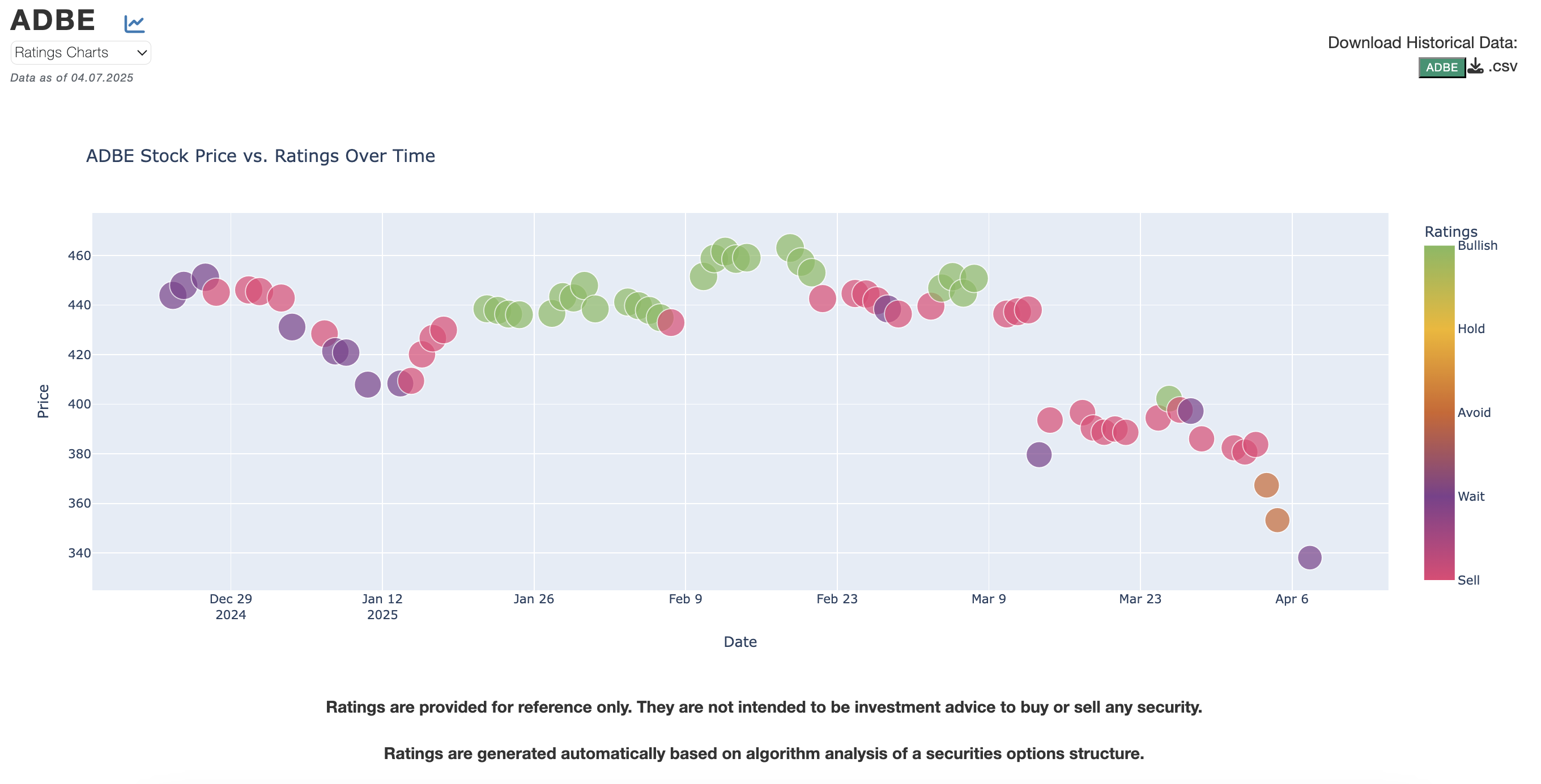
Dashboard Data:
- GEX:
$1.9M - Dist to Flip:
17.95% - IV:
45.27% - Rating:
WAIT
Interpretation: ADBE is attempting to stabilize after a downtrend and currently sits in a transitional setup.
Action: Wait for stronger structure, ideally with price moving above the GEX flip level.
Real Use Case 2: Should I Buy GLD?
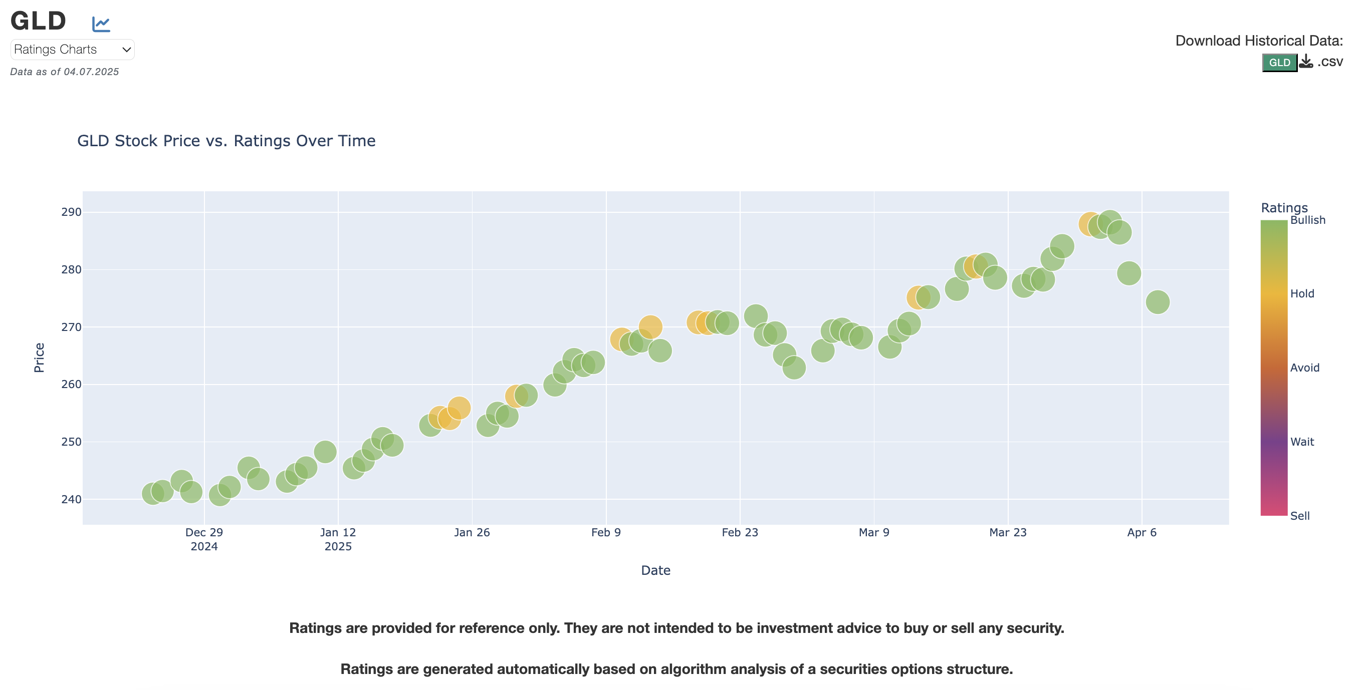
Dashboard Data:
- GEX:
-$30M - Dist to Flip:
-0.79% - IV:
18.9% - Rating:
BULLISH
Interpretation: GLD is in a bullish trend but currently sits near the flip level where positioning could change.
Action: Continue holding if already long, but monitor the flip level before entering new positions.
Final Tips
- Start by focusing on three key columns:
- Rating
- GEX
- Dist to Flip
- Then use additional columns like IV, Expected Move, and Skew to refine your view.
- The dashboard works best as a quick market structure scanner to identify where options positioning may influence price behavior.
Need more help? Check out more guides in our Education Center.
We’re building additional walkthroughs to help you get the most out of Trading Volatility. Let us know what you’d like to see next!
Not a subscriber yet? Create your account to access the full dashboard and daily alerts.